Button
Contents
What's a Button?
A Button should be used when a user is given a possible action – these are usually things like submissions, confirmations, cancellations, etc. They can serve many purposes, and are mostly used to initialise a certain process within the system.
Buttons should be used when a Call to Action (CTA) is needed on a page, Form or Card. Users will recognise that a Button must be pressed (or tapped) in order to carry out a specific task.
Anatomy

- Label
- Container
- Icon
Styles
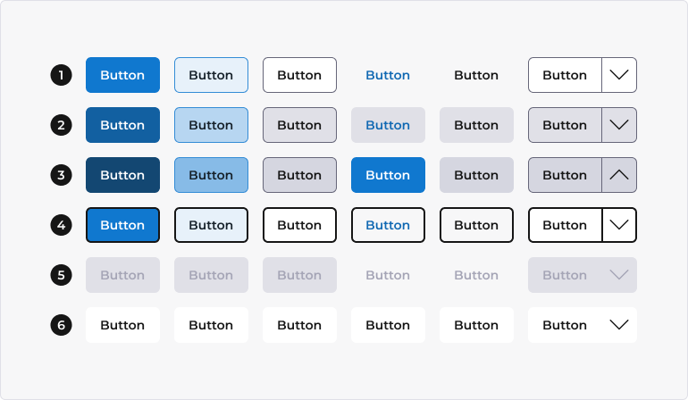
Buttons are available in 6 styles - solid, soft, outline, text, ghost, and split.

- Solid - high-emphasis buttons with a solid background, used for all important actions, such as your primary action (which may or may not use the primary colour).
- Soft - medium-emphasis buttons. They contain actions that are important, but aren't the primary action in an app.
- Outline - low-emphasis buttons with a simple outline. These are primarily used for all secondary actions, but they are also useful when a button is on a coloured background.
- Text - text-only buttons that appear like a regular blue hyperlink.
- Ghost - transparent buttons, which have no border or background colour.
- Split - buttons that contain a dropdown of related actions. For example, a Save button might have Save as its default action, but have Save and Clear, and Save and Exit as its related actions.
Resources
Note: these will be tile buttons in the full release.
Contents
Sizes
Buttons are available in 4 sizes - extra small, small, medium, and large.

- Extra small
- Small
- Medium (default)
- Large
Contexts
Context helps convey the information being communicated. Button contexts correspond to a colour to provide a consistent experience for users. For more information, refer to the Colour guidelines.
In Mosaic, there are six contexts for Buttons. Each has a different function, and the look of the Button will signal a different usage to the user. For example, a Primary button tends to be the most positive outcome for an action, things like submitting a form or saving a sheet. Conversely, a Danger button tends to be something negative, like deleting something.

- Primary - used for the main CTA on the screen. This is reserved for actions such as add, create or import. There should only ever be one Primary Button on the page, Form or Card.
- Secondary - buttons that do not fall into one of the other categories. This can be used for things that are largely inconsequential but necessary, like closing a dialogue box. The secondary default button is now no longer used, we now use an Outline Button for these types of actions.
- Success - used for positive actions, like saving, confirming or accepting. Typically, like the Primary Button, there should only be one Success Button.
- Danger - should be used for dangerous or destructive activity, like deleting or removing something from the system. Typically this should be the only Danger button available to the user at that time.
- Warning - not used very often, but they can be useful when you want the user to take caution with a particular action. You might want to include a Button to reload some data, for example, but want to warn the user not to do this too often.
- Info - can be used when the user might require some more context, or for less important actions than the Primary Button. Some examples would be an Info Button that opens a new dialogue box with some additional information, or perform an action that does not leave the page or make any change to data, i.e. print or view guidelines.
Spacing
Buttons have the following margins and padding.

States
Buttons have 6 states - default, hover, active, focus, disabled, and loading.

- Default
- Hover
- Active
- Focus
- Disabled
- Loading
Compositions
Buttons are available in 4 variations - icon only, label only, with a leading icon, and with a trailing icon.

- Icon only
- Label only (default)
- With leading icon
- With trailing icon
Contents
Order least positive to most positive
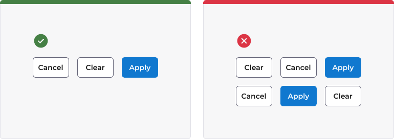
We have a set order for groups of Buttons in our products, to encourage user familiarity and build a consistent 'language' around what a user can expect, and where. The ordering is simple: the least positive Button is the one furthest to the left (but to the right of any Cancel or Close), and the most positive Button is the one to the right.
As an example, a form with 'Cancel', 'Clear', and 'Apply' would be ordered as such – 'Clear' is the most negative, 'Apply' is the most positive, and 'Cancel' is relatively neutral but present in a lot of screens so is always furthest left for consistency.

This ordering of the Buttons provides a sense of 'moving forward' to the user when they see a Button on the right-hand side, whereas a Button on the left-hand side feels like 'moving backward'.
Only one primary action
Buttons presented in pages, dialogs, or drawers must only contain a single primary action. This makes it easier for users to see what they should do next or what is the most important action.

Consistency
Consistency among your Buttons is vital for users. A user needs to feel comfortable, confident and at-home when using our products. Button consistency is a really easy way of achieving it – if a user can tell with a quick glance what the Buttons do in a new feature, based on their previous experience with the product, then they will adopt it much quicker, and user errors will be minimised. Inconsistent Buttons quickly lead to poor adoption of products and rampant confusion.
A few ways you can achieve consistency is making sure your Labels are identical in all areas – do not switch between using 'discard' and 'cancel' on your Buttons. Pick one, and stick with it. The same goes for Icons. Make sure you review your Buttons in comparison to others in the system when making them.

Button labels
A Button's label is as important as the Button itself. A set of Buttons that are simply a green and a red Button might imply 'good' and 'bad' actions, but there is no context for the user. As such, there are a couple of things to keep in mind when labelling a Button:
- Buttons require a Label in the vast majority of cases. We cannot assume that a user will instinctively know what an icon means on a Button. An infamous example of this is the classic floppy disk icon for saving – think about how soon it will be until virtually all of our users will have never seen a floppy disk?
Note: there are some very specific use cases for Icon-only buttons, but these are few and far between. We have guidance on where a Button can forgo a label, but the UX Team should be contacted in advance of using an Icon only button to ensure that it is appropriate.

- Button labels should be specific, rather than general. A user should feel confident that they know what a Button does. Generic Buttons like 'OK' when a user is actually changing something are not informative enough – the user needs to know that the Button will 'Confirm' changes, which is a much better Label.
Deciding when you should use Cancel or Close as your button label is very important. Historically many applications used Cancel as a means to leave a screen or page. However, we would strongly recommend Close is used in this instance. Cancel should be reserved for instances such as forms where cancelling out of the form discards any changes the user has made.
If you are unsure about Labels, you can take a look at our Tone of voice guidance or contact the UX Copywriter.
Button icons
Icons can be used to give further meaning to your Buttons. By default, all Buttons in a page header should have an Icon, but occasionally this is not always practical when there is not an obvious Icon available for use, or there are space limitations for the Button. In cases like these, it is acceptable to forgo an icon.
When using an Icon, the Icon should always appear to the left of the Button's Label. The Icon is describing the Label, not the other way around! It also improves readability and is easier to quickly scan the functionality of each Button if the Icons all appear on the left-hand side. The one exception to this is when an icon is used to indicate direction of travel. In this scenario, icons are permitted on the right-hand side of a label, e.g. a Next button.
![]()
Button spinners
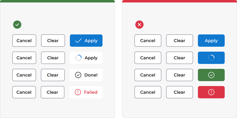
Spinners can be used in Buttons to provide an inline loading state. When a Spinner is used on a Button, it should replace the button's default icon, as below. The Spinner will animate, providing visual feedback to the user to reassure them that they did indeed trigger an action and it has been registered by the system.
Spinners should not be used for actions that will take longer than a few seconds - if a user is looking at a page and waiting for 10 seconds or more, they are likely to grow impatient and assume that the page is broken.
It can be a good idea to include a third button state that indicates the success or failure of an action. For example, if we were checking a URL or validate a user, then the text should change to a positive or a negative based on the outcome, with an accompanying icon.

Contents
Component accessibility
This component has been built to meet the current WCAG AA 2.1 guidelines. We also test these components against the guidelines before release.
Aria tags
Every component in Mosaic requires an appropriate Aria tag to ensure that screen readers can effectively parse the page. Aria tags are provided as part of Mosaic. Please do not override these without good reason.
Ensure that Aria tags are used as appropriate signposts throughout the product.
Colour Combinations
When designing with a Button, you should be mindful of the colour combinations you are using. The components have been designed with this in mind, but if you are using colours that are not part of the default component, please ensure that there is a clear colour contrast within the parts of the component and between the Alert and the background it is on. To check the contrast, please use WebAIM's contrast checker.
Focus state
A Button needs to have a focus state - a focus state is when you tab into an element to interact with it. Ensure that users can use their keyboard to focus on the Button.
Icons
An icon needs to have underlying code that describes what action the icon takes. the labels should be specific - for example, 'bin' icon for delete should be labelled 'delete'. not 'bin'.
Key Binding
A Button needs to be able to be interacted with via a keyboard. Where possible we will provide key-binds within our Mosaic component or there will be default HTML ones. If this isn't the case then please implement logical key-binds for all intractable components.
Movement/Animation
Please refer to the WCAG guidelines for the time-based considerations for animations.
For additional examples and API documentation, see Storybook
Live demo
Below, you can find a live demo for a Button component. Use the drop-down menus and radio buttons to view the different Button Types and Variants.