Accessibility
Contents
Accessibility in Mosaic
The Mosaic team are passionate about making sure every one of our products is fully inclusive and offers the very best user experience for all of our users.
A great path to achieving usability across the whole spectrum of our users is by following the WCAG 2.1 AA guidelines. We are trying our hardest to follow these guidelines as closely as we can to ensure Mosaic is as accessible as possible, but in some areas this is not currently possible due to things like technology limitations. Making content accessible is a continual process, and we are working towards making every single component, pattern and guideline as accessible as possible – as such, if something does not currently match these guidelines, you can be sure that a plan to achieve that goal is in place across the whole system. Anywhere we are not following the guidelines in our products is spelled out in our accessibility statements, with a clear plan for how and when we will achieve it.
Why is accessibility so important?
By not working to make your product as accessible as possible, you are alienating some potential users of your products. WCAG AA 2.1 is a worldwide industry standard, and accessibility statements are an incredibly useful tool to be transparent about your efforts to be as inclusive as possible – as such, we want to make sure that we are ready to show the world how accessible we are, and where we are planning to improve and when. This feeds into our ethos that every user is important, no matter what their accessibility needs are.
Remember, Web accessibility is essential for people with disabilities, but it's useful for everyone.
So, what do we mean by accessible?
To create accessible products, we must first understand why it's important. To Advanced, an accessible product aims to achieve the following two principles:
- We endeavour to try and give every user the same benefits, regardless of ability or who they are
- We want our products to be able to adapt to any type of user in any environment, and in any context
Accessibility doesn't just encompass people who struggle with vision, or can't use a mouse. Often, people fall into the trap of only thinking about permanent physical disabilities when making decisions about designs. It's important to remember there are other forms of disability which are not only about someone's physical capabilities, but also their environment or situation. Accessibility can also apply to short-term, temporary and/or invisible factors.
The four types of disability that need to be considered are as follows:
| Type | Description |
|---|---|
| Situational | Examples of this include a brightly lit room or area where a person with 'typical' vision is working, this could affect how easy a screen is to view. Similarly, someone in a busy office may not be able to listen to audio or have their sound on. |
| Temporary | An injury to a hand or an arm (or even an eye!) may prevent someone from using a mouse, keyboard, or screen for a short time, but they will be able to use them once they have recovered. |
| Permanent | This is what most of us think of when talking about "disability." An accessibility issue that affects how the user can interact with our software on a permanent basis. This covers things like blindness, dyslexia, and MS. |
| Invisible | Some accessibility requirements are not always visible, this includes diseases like chron's, colitis, mental health conditions, types of pain and many more. When looking at someone with an invisible issue, you may not be immediately obvious that they have accessibility needs. |
It is important to note that accessibility considerations do not always fall into one category. For example, someone recovering from a brain injury could have an issue that was both invisible and temporary.
Accessible design doesn't just offer a better experience to users with accessibility considerations; a truly good user experience is fully inclusive for everyone no matter who they are.
Guidelines
Contents
For many users, keyboard navigation is essential to their daily use of Advanced products. Some users are limited to keyboard-only navigation in web products due to a variety of reasons, such as using voice control for their device or having poor fine motor control with their hands. This is not the only reason, however – some users simply prefer it!
Navigation
Keyboards can be both essential to navigation on a website, but also can solve some simple UX problems. Imagine a data entry clerk - they may need to enter 100+ transactions every single day. They are using a piece of software that means that after every few steps in the data entry, they have to stop typing, grab their mouse and move the cursor to a new point on the page, or click a button to continue their process. Not ideal, right? This is what's known as "dual-interaction" – the user needs to use two different devices to interact with the page. On the one hand, this is an irritating and repetitive task that the user has to take regardless of their accessibility requirements, but on the other hand a user that can't use a mouse finds themselves stuck – they can't complete the task. To rectify these, the solution is a simple step of allowing the user to use the tab key to move the focus on the screen and use the enter key to function as the click of a mouse.
The Mosaic team are dedicated to ensuring this type of dual-interaction is not required, and are making every effort to ensure our components and pages are keyboard friendly.
Every navigational element and function should be made accessible via the keyboard. This includes (but is not limited to):
- Making sure everything can be accessed using the tab (or arrow) keys
- Setting the tab sequence to be logical and correct
- Setting events on actions that can be triggered using the keyboard (onClicks etc.)
- Making sure you can skip repetitive elements on the page (for example the navigation).
Focus
It is vital that a clear focus indicator is made available to all navigable content so that when the user is using a keyboard to move around the page or product, a clear indication of where they are is necessary.
Mosaic components have this feature built in to ensure all components have an obvious focus indicator - in our case, a change in border colour.
Key Binding
Throughout the Mosaic Design System, we aim to provide a standard suggestion for key binding in each component – however, it will be down to you and how you implement each component to ensure correct tab sequences and page layouts. We cannot cater for every eventuality, and this will require some use of good old common sense.
The use of other keyboard shortcuts can be used - such as something like Ctrl+K to trigger other actions, but it should never use 'common' keyboard commands to do something other than its common use. For example, you should not use Ctrl+P to trigger an action when this is more commonly used for Print or Print screen.
Keyboard traps
Another key aspect to consider for keyboard users is the 'keyboard trap'. A keyboard trap is when a user's focus (i.e. what is currently 'in focus' while navigating with a keyboard) cannot be moved with a keyboard. To move the focus, the user will have to use another method, like a mouse.
You must ensure that if focus can be moved to a component using the keyboard, then it must also allow focus to be moved away using the keyboard. If the method of moving away requires anything more than simple arrow or tab navigation, then the user must be informed of this method. However, you should try your hardest to avoid any such situations. They should be a last resort.
Contents
Colour is a key factor in making our products accessible and can have a real impact on the user's experience. Colour can provide context clues for users that struggle to read (for example, a red 'delete' button shows that this button may be destructive) but can also be a hindrance when someone is colour blind.
Colour blindness
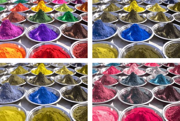
When using colour, it is vital that we consider how that colour may be interpreted. Not just by users without visual impairments, but by those using assistive technology or have one of the following types of colour blindness (with example images below):
- Protonopia (top right) - reduced sensitivity to red light
- Deuteranopia (bottom left) - reduced sensitivity to green light (this is the most common)
- Tritanopia (bottom right) - reduced sensitivity to blue light (this one is extremely rare)
- Greyscale - completely devoid of colour. Can only see different shades of grey
People with Protonopia or Deuteranopia, typically known as red-green colour blindness, find it difficult to distinguish between red, green, brown and orange. People with Tritanopia find it difficult to distinguish between blue, purple, grey, black and greens.
More information on these can be found on the colour blind awareness website
Notice the differences? If you wanted to include some form of highlighting on something like a data table, where you show warnings in red and positives in green, a user with this form of colour-blindness would not see any difference between the two. Including an icon or text alongside that colour would go a long way to making the data table accessible to everyone.
A hard and fast rule across the Mosaic Design System is that we never rely on colour alone to convey meaning to any part of our products.
Colour Contrast
It is essential that the correct contrast ratios are considered when developing new screens and products. If the contrast is too low, users can find it difficult to distinguish important items on the page.
Getting the right contrast ratio means we can improve the experience not only for users with low-contrast or colour-blind vision, but also for users who may be impacted by a temporary situation, such as screen glare or poorly-lit rooms. The Mosaic team adhere to the WCAG AA 2.1 guidelines that text (or visual representation of text) should have a minimum contrast ratio of 4.5:1. There are a few exceptions to this, such as extra-large text (minimum 3:1), or logos and page decoration.
In order to check the colour contrast of your product, you can use this contrast checker.
Contents
Our standard of WCAG 2.1 AA is now the very minimum standard of accessibility that our customers expect. If these guidelines are adhered to, then you will reap the benefits of both being an awesome product for users with accessibility considerations, and also protect yourself when it comes to laws around accessibility (such as in the US).
If you aren’t following the guidelines, or aren’t working towards it, you could be taken to court for disability discrimination, no matter where the users are based. It does not matter where the product is based, it matters where it is used. Please make sure that you complete an accessibility statement (see below) to show the customer and the users that you are working towards fully adhering to the WCAG AA 2.1 guidelines, or indeed that you already have done so.
Accessibility Statement
At Advanced, all products must have an accessibility statement and it must be displayed within the product in a way where the user can access it from every page (similar to a privacy policy).
Accessibility statements outline how closely a product follows the WCAG guidelines, and where the product falls short. It also outlines the plans for when the product will fix any of the accessibility issues the product may have. These dates must be met, otherwise it could be seen as discrimination and can leave you open for legal troubles.
Software consumers are asking for accessibility statements more and more in recent years when they are looking at buying software. It is vital that these statements ready to go to take advantage of these opportunities – but also, it's just the right thing to do. Remember, a truly good user experience is fully inclusive for everyone no matter who they are.
To help understand how your product matches up with the guidelines, you can follow these steps:
Check your product against these Advanced code and visual accessibility guidelines.
Use our recommended tooling WAVE to assess how compliant your product is.
Download and fill out our ready to be displayed on your site.
Where we do use Pendo within our products, we are limited by the levels of accessibility that Pendo offers in order to guarantee a AA level of accessibility. You can read more about the work that Pendo's doing to create an accessible product on their blog.
If your product is using or implementing Pendo then please ensure that you are adhering to the following guidelines so that we can ensure as much accessibility as possible:
- The link to access Pendo in the 'Product Hub' can be accessed and operated using a keyboard as well as the contents within it.
- All guides, on boarding or general popups etc., can all be accessed and operated by using a keyboard.
- The colour themes for the guides are using our product branded colour theming and is signed off by your UX designer.
- Copy is written as short and simply as possible in an inclusive manner. Please refer to the Style Guide for more information.
- The link to access the product hub uses the correct icon and is displayed in a way that follows good colour contrast.
- All these guidelines need to be met by the next time you review your accessibility statement or within one year of implementing Mosaic. Please ensure that your position regarding these guidelines are explained within your accessibly statement.