Whitespace
Contents
What is whitespace?
Imagine a webpage as being a bit like sitting in the pub with a group of friends. They've each got something great to talk about, and you really want to catch up with them. Sounds great so far, right? But, if everyone starts talking at once - you’re not going to take in a lot of the conversation, are you?
Whitespace is like a mute button. More whitespace equals less noise, making it easier for you to focus on one particular person. It’s not a new concept, in 1930 Swiss typographer, Jan Tschichold noted:
"White space is to be regarded as an active element, not a passive background" – Jan Tschichold, 1930
Also known as negative space, whitespace is the empty space around your page elements; buttons, images, links and lines of text, etc. Considered by some to be a waste of valuable screen real-estate, however, when used correctly it’s an invaluable design tool.
Why we use whitespace
We make use of 'whitespace' to ensure we provide an accessible and comprehendible UI. With many B2B applications there can be a lot of information and data. For many users this can cause readability issues and cognitive overload.
While trying to fit more things on a screen, cluttering your interface overloads your user with too much information. Reducing the clutter improves comprehension. By removing distractions, your users can focus only on what’s immediately visible. This reduces the user’s cognitive load and results in a more pleasant user experience. For example, by increasing line heights (to improve legibility) or by making touch targets larger (with more whitespace around them) you can prevent accidental clicks.
Many users are more accustomed to scrolling in todays digital world. However, it's still important to prioritise your content! Make the most valuable information available nearest the top of the page. While modern webpages tend to be long and include negative space, and users may be more inclined to scroll than in the past, people still spend most of their viewing time in the top part of a page. Content prioritization is a key step in your content-planning process. Strong visual signifiers can sometimes entice users to scroll and discover content below the fold.
In summary, white space is:
Super important in design.
Used to break up sections on a page or to help create focus.
Helps with information processing; too much info can be overwhelming or disorienting.
Helps with legibility.
Aids visual hierarchy.
Lets the user’s eyes rest.
Page structure
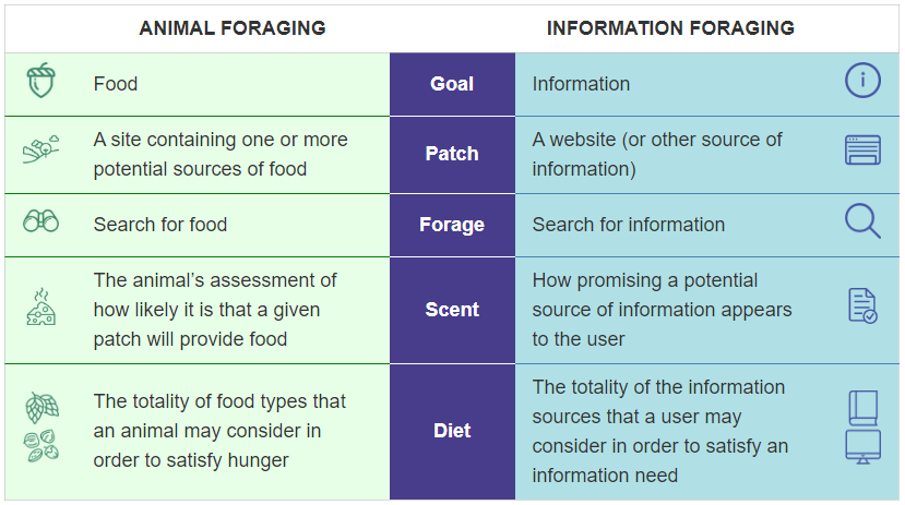
Whenever a user visits your app or web page they engage in a behaviour pattern known as Information Foraging, with this behaviour, named after animal foraging, the user makes a decision on whether to remain on your page based on two points:
- How promising the information on the page is
- How difficult it is going to be to access that information
So, our decision to stay or go will be based on the amount of information we are likely to find, relative to the cost of finding that information.

Information Foraging: A Theory of How People Navigate on the Web, retrieved from https://www.nngroup.com/articles/information-foraging/
A cluttered interface, lacking a clear hierarchy, closely clustered elements and unnecessary content is going to increase the user’s difficulty in accessing that information.
A lean interface, on the other hand, will highlight important elements (which have been prioritised using whitespace) and our users' eyes will effortlessly catch that element.
Accessibility
We all have different needs and requirements, and they change throughout our lives. Understanding and accommodating these changes are vital, it is our responsibility to our users. We need to understand and accommodate both cognitive and physical differences.
Whitespace can help us in this regard. Two examples - by increasing line heights (to improve legibility) or by making touch targets larger (with more whitespace around them) to prevent accidental clicks.
Increasing comprehension
While cluttering your interface overloads your user with too much information, reducing the clutter improves comprehension. By removing distractions, your users can focus only on what’s immediately visible. This reduces the user’s cognitive load and results in a more pleasant user experience.
Communicating relationships and distinctions
The fields of UI and UX Design are underpinned by the Gestalt Principles. This set of principles implies that we see patterns and configurations, as well as their separate components. Seven of the eight principles are used throughout interface design, on the web, and in every application we use. Of that seven, four rely heavily on the use of whitespace. They are:
- Law of Proximity - Objects close together will be perceived as a group
- Law of Symmetry - Symmetrical objects will be perceived a group
- Law of Common Fate - Objects that have the same path will be perceived a group
- Law of Continuity - the individual elements of a whole object will be considered a group
Contents
What is "the Fold"?
The fold is the bottom of a webpage.
Whitespace and the fold
Whitespace often pushes important content beneath "the fold", where your users can't see it and potentially miss it completely. From a user experience perspective this isn't ideal. It's a bit like sitting in the pub with a group of friends. So, can whitespace and "the fold" live together in harmony?
Above "the fold"
What is above "the fold"
Besides being the arch-enemy of whitespace to some, above the fold is a term which originated in the newspaper print industry. On a newspaper the most important headlines in that day’s publication are prioritised on the front page, above the line where newspapers are traditionally folded.
When applied to the web, above "the fold" refers to the area of a webpage which is visible when the page first loads, the viewport, below the fold is the area the user will need to scroll to, to view.
It would be a mistake to write about the benefits of whitespace without considering the importance of above "the fold", after all it’s probably the most frequently used argument against the use of whitespace. It’s also a valid argument, when we consider that:
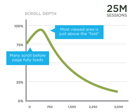
- The most viewed area of the page is just above the fold, at about 550 pixels, with just over 80% viewership
- From this peak at 550 pixels, there is a slow decay in viewership. About 50% of readers see 1500 pixels down the page on content pages
- On home pages and section fronts 50% of readers make it to pixel 1000

There Is No Fold by Luke Wroblewski, retrieved from https://www.lukew.com/ff/entry.asp?1946
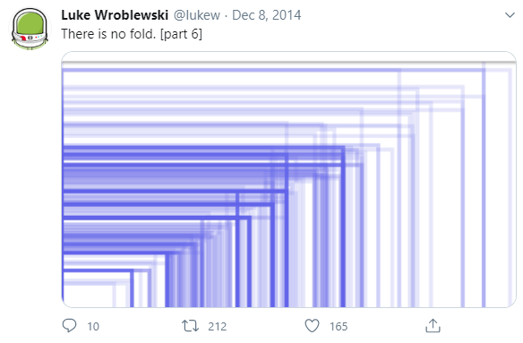
However most of the arguments began in the 1990’s, when 800×600 was the most prevalent screen resolution, having had a market share of 76% in 2000. Let’s fast-forward to December 2014 and the fold is looking decidedly different, with 3,997 devices, over 6 months to one website showing:

There Is No Fold by Luke Wroblewski, retrieved from https://www.lukew.com/ff/entry.asp?1946
Even since 2014 devices have evolved, and new form factors developed, however user behaviour and navigation methods have also evolved.
For example, the prevalence of mobile devices have meant that when we now scroll, it’s a passive, subconscious behaviour, requiring less cognitive input. This evolution has allowed some of the world’s most popular web destinations, including Facebook, Instagram, Twitter, Pinterest, and Google, to display the majority of their content below the fold, in a never-ending waterfall of compulsive content.
Minimising the impact of "the fold"
There are ways. Content prioritisation is the most important step we can take, our Call to Action (CTA) should be above "the fold", our key business and user goals should be above "the fold".
We can use strong visual signals to entice our users to scroll and discover content below "the fold".
We need to beware of false floors (for example, a horizontal rule at the bottom of the viewport which might be misinterpreted as the end of the page).
There’s a long list of tricks we can use to take the fear out of "the fold" and if we follow these simple steps whitespace and "the fold" can finally live together, happily ever after.