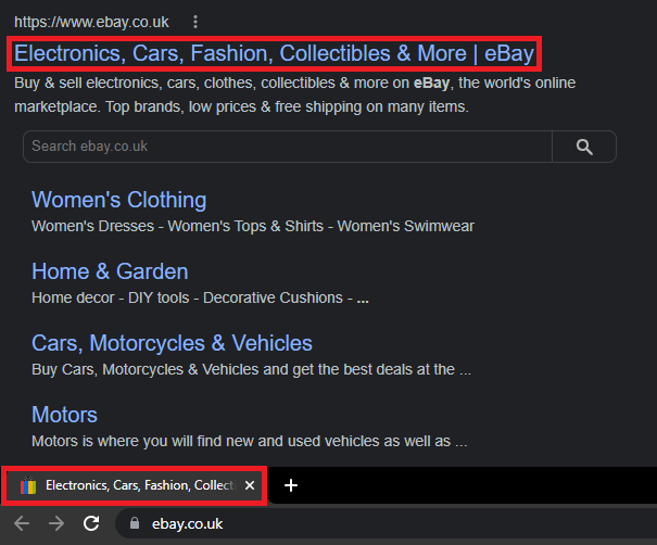
Browser tab titles
Contents
The <title> HTML element is an important thing to consider when creating web products – it has an impact on many things, and not just the UX of your product. Title tags play a role in site hierarchy, contextualising a page for the user, and search engine optimisation (SEO).
Title tags have two effects on your page that you can see – first, they control what heading shows up on a search engine results page (SERP), which can help users know exactly what the link in their search result leads to. Second, title tags are used to control what heading is displayed in the toolbar and tabs on browsers, which serves a similar purpose.

In this guide, we'll focus more on tab headings, as they are the more important for creating a great user experience. Results on a SERP are important when you need to promote visibility of your webpage among competitors, but in B2B software the user already knows what your product is and how to get there – more than likely, they'll just save it in their browser bookmarks.
Tab headings are very important to a user when using a web product. It is key to ensure that they are descriptive of what the webpage is – if a user is swapping between several different tabs in their workday, an accurate description is vital to helping them navigate to the page they want quickly. It helps the tab stand out and highlight to the user what they've already got open.
As such, we recommend that all title tags within your products should follow a very simple structure:
The main page header text, followed by a pipe ("|"), followed by the product name.
Most important to the user is what page in the product is currently open, e.g. the home page. The product name itself should also be included in the tab title, but it can be placed at the end of the title so it is more likely to be cut off by the tab character limit – the favicon should be recognisable enough that they can infer what site it is from the image alone, even if it's just an OneAdvanced chevron. If they have several OneAdvanced products open with similar favicons, they can still fall back on the product name being included in a tab title (hovering over a tab will show the full name in a popover). For more information on favicons, please refer to the brand guidelines
So, for example, on a Desk in MyWorkplace, the tab would read:
"UX Design Desk | MyWorkplace"
At a glance, the user knows exactly what to expect if they open that tab. Even if they have several tabs open and the title is truncated, they'll still see the most important part. Home pages might not have a heading and may instead display a welcome message as the header text. In this instance, the header text should be replaced with "Home", i.e. "Home | MyWorkplace".
Providing effective and descriptive labels on tabs will help to reinforce the context of a page to the user, and provide a much greater visibility of what is open when they are on a different tab. It's also a great help when users have several instances of your product open – they can easily see at a glance which tab they need.